Do Design Principles Matter?
Proportion, Scale etc.
“If proportion is the good breeding of architecture, symmetry, or the answering of one part to another, may be defined as the sanity of decoration.” — Edith Wharton
Throughout the Western canon of art and architecture, there are certain rules and orthodoxies that have been employed as a means of instilling some form of visual order and harmony. The fundamental principles of design as we think of them today are emphasis, balance and alignment, contrast, repetition, proportion, movement and white space. There are of course those unique methodologies that have been developed over time, for example, if one looks to Europe’s classical roots, in Ancient Greece the golden ratio (also referred to as the “divine proportion”) was believed to create visual harmony in any branch of the arts. Applications in architecture can be found in anything and everything from Notre Dame (1163-1345), to the Taj Mahal (1632-53) and, more recently, the UN Secretariat building (1947-42), which was designed by avant-garde modernists Le Corbusier (1887-1965) and Oscar Niemeyer (1907-2012). Of course, prior to its construction in 1943, Corbusier had developed his own “Modulor” system, or rather an anthropometric scale of proportions he described as a “range of harmonious measurements to suit the human scale, universally applicable to architecture and to mechanical things”. The Modulor was devised with the somewhat lofty ambition of reconciling maths, the human form, architecture and beauty into a single system; a search that had obsessed Pythagoras, Vitruvius (80-15 B.C.) and Leonardo Da Vinci (1452-1519) before him. The fundamental “module” of the Modulor is a six-foot-tall man, which, somewhat bizarrely, was allegedly based on the usual height of the detectives in the English crime novels Corbusier enjoyed. This was, of course, some years prior to Ian Fleming (1908-1964) writing his James-Bond series of spy stories and so 5’10 Daniel Craig needn’t in any way feel insulted (and for that matter, the Modulor was randomly plucked out of the air and there was absolutely no reason it couldn’t have been 5’10 or even 6’2). Despite its somewhat arbitrary nature, rather than some obscure personal passion, Corbusier’s universal Modulor was met with widespread praise; it was used by such illustrious architects and designers as Georges Candilis (1913-1935) and Jean Prouvé (1901-1984), and even the great theoretical theorist Albert Einstein (1879-1955) described it as “a tool that makes the good easy and the bad difficult” — which must have done wonders to bolster Corbusier’s already towering ego. One of the only reasons it didn’t catch on is that the imperiously controlling Swiss-French architect, somewhat audaciously, wanted to patent the system, so as to claim royalties from those who used it.
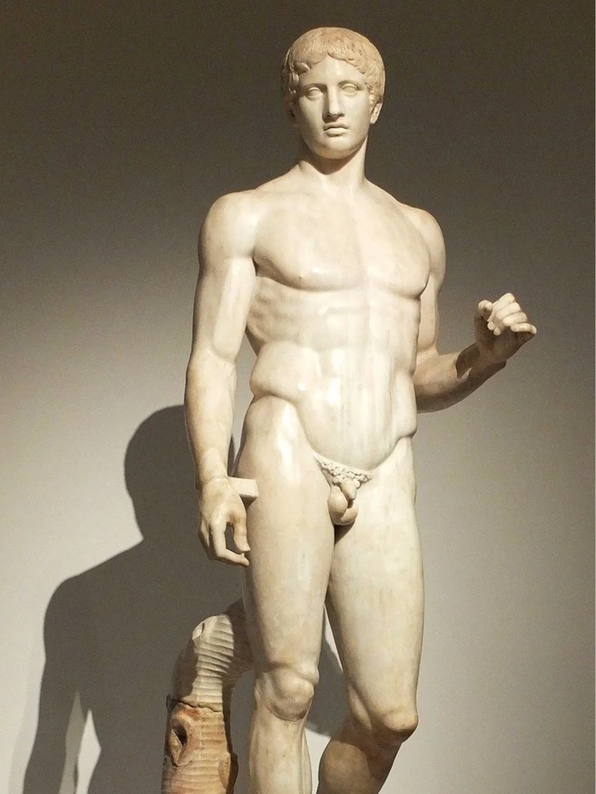
A Roman reproduction of the Doryphoros (“Spear Bearer”) of Polykleitos from Pompeii;, at the Naples National Archaeological Museum
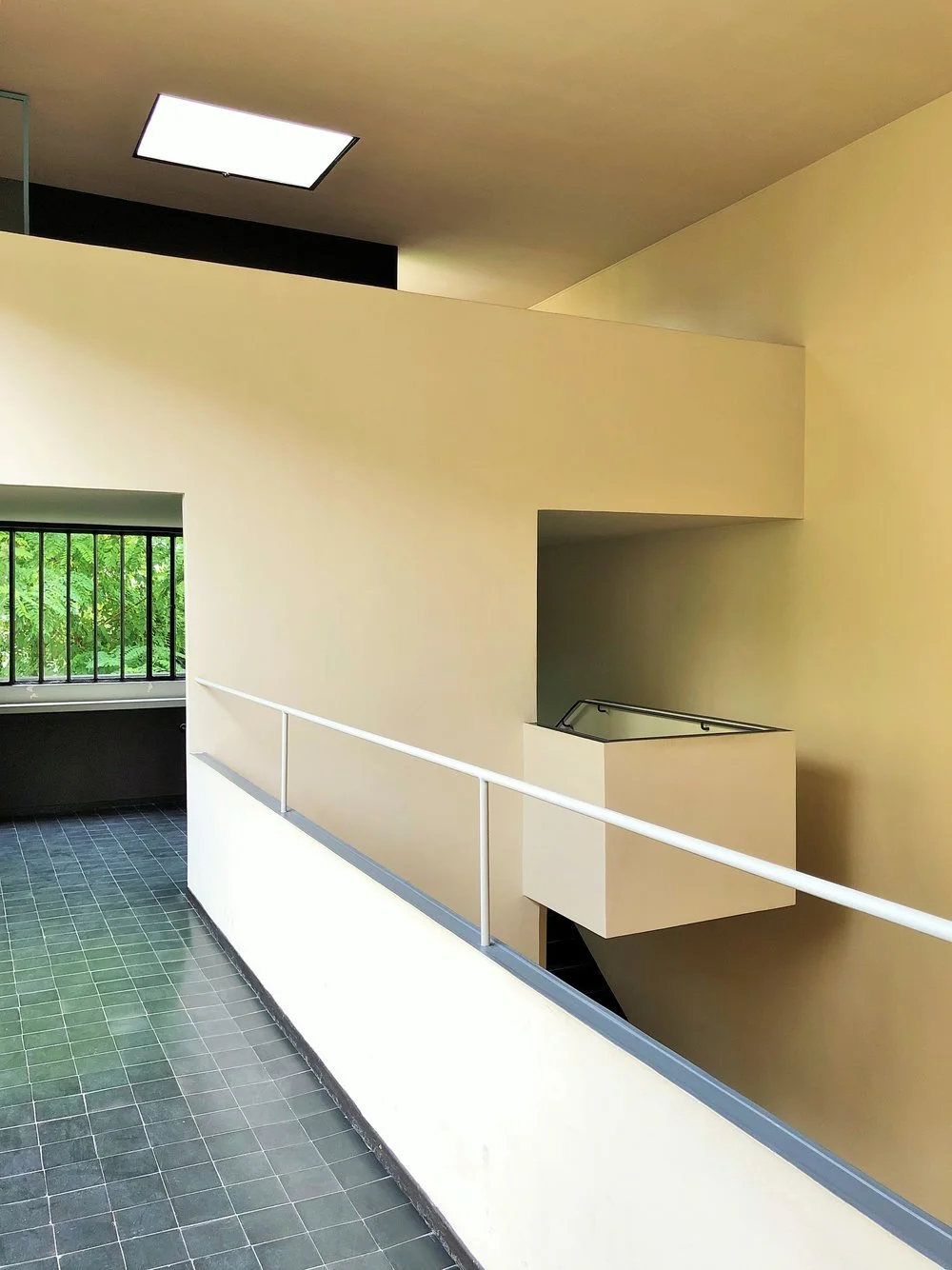
The hallway at Maison La Roche, Paris designed by Le Corbusier according to his “Modulor” system of proportion, photograph ©The London List
It perhaps goes without saying that things that are in proportion with one another seem naturally more pleasing to the eye, and whilst Corbusier’s own application of the Modulor was somewhat haphazard (for e.g. the children’s bedrooms in the monumental concrete Unité d’Habitation in Marseilles are six feet by 23 feet, which is not exactly an elegant proportion), perhaps most importantly, it put consideration of the human form and the practicalities of every day living at the centre of design. In the years since, in a post-modern architectural age driven by computer processors, the human proportion has, to some extent, become less of a concern; a development which can at least in part be attributed to society’s understandable discomfort with the fetishisation of the ideal body as a norm. Of course, if we look to the origins of where the “idealised form” first came from, we find ourselves back in ancient Greece, as along with the “golden ratio” that first inspired Corbusier’s quest for architectural perfection, the canonical classical body as established in sculpture in the fifth century BC, has since become the most influential and imitated style in the arts. Indeed in much the same way a designer might now consider the way in which a building’s occupants will use a space, the body in movement, both realistic and transcendent, was at the centre of Greek art and thought. It’s the implication of movement which is truly the transfiguring achievement of such classical sculpture, for e.g. the Doryphoros (“Spear Bearer”) of Polykleitos (originally designed around the time of the Parthenon c. 440 BC), which depicts a solidly built warrior, originally bearing a spear balanced on his left shoulder, became even in antiquity a byword for absolute physical perfection. The renowned nude bronze is perhaps one of the best-known and earliest examples of classical contrapposto and realism. Greek sculptor Polykleitos conceived the work as a demonstration of his written treatise, entitled the Κανών (or “Canon”), translated as “measure” or “rule”, exemplifying what he considered to be the perfectly harmonious and balanced proportions of the human body in the sculpted form. The heavily muscled athletic figure stands simply with spear in hand, poised at the moment he steps forward from a static stance. It depicts the tiniest incipient motion, and yet the way in which weight is distributed on the one supporting leg, the counterbalance of weight throughout the torso, and the head, which is slightly inclined toward one shoulder, make it somewhat paradoxically at once both realistic and sublime.
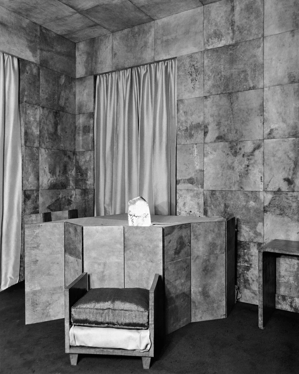
A parchment clad interior by French decorator Jean-Michel Frank, demonstrating how the designer employed traditional principles of proportion whilst using materials in unexpected ways
It seems something of an uncontroversial statement to say that architecture and interior design differ from art as both have to have a function or purpose. Perhaps on that basis, they’re closer to fashion, which might explain why the homes of so many great couturiers, for e.g. Karl Lagerfeld (1933-2019), Coco Chanel (1883-1971), Roger Vivier, (1907-1988) and Hubert de Givenchy (1977-2018), have, over the years, become so iconic. Pierre Bergé (1930-2017), the French philanthropist, patron and aesthete, who was the driving force behind the creation of Yves Saint Laurent, spoke frequently about the interrelationship between art, fashion, interiors and photography explaining in an interview: “I think photography is like fashion. That means it is not an art. But fashion and photography need an artist to exist … Saint Laurent is an artist, a great artist. But you cannot hang a dress like a painting”, and perhaps somewhat unexpectedly, referring to their extraordinary homes, including the treasure-trove duplex on rue de Babylone, Villa Oasis and Château Gabriel, “The art collection is exactly the image of Yves and I. We made it as a collection. Two men with ... not with taste.” Whilst a good many of us might think of the couple as veritable arbiters of taste, when challenged, Bergé replied curtly: “L’art c’est plus que nous. Plus grand” (Art is greater than us. It is bigger). Regardless of whether or not architecture, interiors and the plastic arts can be thought of on the same level, it’s clear that at the same time Corbusier concocted the Modulor, artists were questioning the importance of scale and proportion and whether or not it mattered in terms of visual representation. Early on in his career Picasso (1881-1973) made a deliberate and informed decision to reject those formal “rules” learned by the “artistically correct” at European academies, abandoning three-dimensional perspective and harmonious proportion, and instead, using distortion and dislocation, whilst at the same time, borrowing heavily from ethnographic and indigenous art.
Les Demoiselles d'Avignon (“The Young Ladies of Avignon”, and originally titled “The Brothel of Avignon”) (1907), which depicts five naked women, each composed of flat, splintered planes, is perhaps the most radical painting of the twentieth century; breaking entirely from traditional composition and perspective painting, it revolutionised the way in which artists saw and transformed reality. Though hard to understand today, the painting proved so utterly controversial that when it was first exhibited, artist André Derain (1880-1954), himself no stranger to seeking out new modes of representation, having co-founded Fauvism with Henri Matisse (1869-1954), suggested to Picasso that he would one day kill himself for the shame he had brought on the art establishment. Originally, Les Demoiselles was going to be an allegory of venereal disease entitled “The Wages of Sin”, and in an early study, Picasso sketched a sailor carousing in a brothel amongst prostitutes and a young medical student holding a skull, which was a symbol for mortality. The subsequent painting is of course far simpler, and only women appear, but they’re far from the sort of classically idealised feminine beauty as depicted in for e.g. Ingres’ (1780-1867) Venus Anadyomene (1848) and at the same time, bear no resemblance to those “traditional nudes” viewers had become accustomed to seeing in the 1880s when Degas (1834-1917) and Toulouse-Lautrec (1864-1901) had begun to capture them in the moment of the “parade” (whereby prostitutes announced their wares and services to clients). Picasso wanted to find an artistic language capable of expressing a rapidly changing world, and in depicting this new reality he chose to abandon harmonious bodily proportions. As an aside, Les Demoiselles is also an interesting example of how the canon of art history is inextricably woven together through time; the faces of three of the women were derived from the pre-Roman Iberian bronzes Picasso had seen at the Louvre (the other two inspired by African masks), which in themselves visibly reflect classical Greek and Phoenician ideals of physical perfection. Yet, unlike their forebears, the faces of these women are sharp and knife-like, self-possessed and looking directly at the viewer, no longer there solely for the pleasure of the male gaze. In this respect, Picasso has often been characterised as a misogynist, a man who feared as well as desired the female form (Dora Maar (1907-1997) was perhaps the only one of Picasso’s lovers to have escaped emotionally intact) and some have suggested their bodies, which appear almost sharp to the touch, are reflective of this inner turmoil. As art critic Robert Hughes (1938-2012) so succinctly put it, “No painter put his anxiety about impotence and castration more plainly than Picasso did in Les Demoiselles, or projected it through a more violent dislocation of form. Even the melon, that sweet and pulpy fruit, looks like a weapon”.
It’s clear that rather than being neglected or misunderstood, the fundamental principles of design, in their traditional sense, were deliberately disregarded as a means of expressing the vitality of a new Millenium in which there were rapid advances in every branch of the visual arts. Indeed if we look to the contemporary built environment there are numerous architects, such as Zaha Hadid (1950-2016), Daniel Libeskind (b. 1946) and Rem Koolhaas (b. 1944) who, much like their early twentieth-century predecessors, have questioned the very nature of space and traditional preconceptions of what a building should be. In his seminal book S, M, L, XL (1995) Koolhaas even went so far as to dismiss scale and proportion as being entirely inapplicable to contemporary architecture and, in particular, in the context of cities that present “bigness”. This is a concept he defines as a definitive trait of contemporary architecture, whereby new buildings emerging in cityscapes across the globe are becoming characterless and standardized, with no clear function, and in terms of scale, far larger than they need to be. Of course, at the same time, there are certain works by “Starchitects” such as Frank Gehry (b. 1929) and Richard Rogers (1993-2021) that have been heavily criticized for paying little more than lip service to geographical location and topography, modelled almost as if domestic utensils to be held by some giant hand. Such buildings often appear entirely at odds with their neighbours, sharing nothing whatsoever in terms of orientation or vernacular. To my mind scale, along with myriad other design decisions, such as the choice of materials and form, should be in response to a programmatic set of needs — and whilst of course, there will be situations in which one large structure might be the best response to those needs — a media fascination for “bigness” in any field, i.e. when a building is the largest, a bridge the longest or a tower the highest, will inevitably attract more column inches than equally deserving, often more so, smaller projects by lesser-known studios. In terms of interior design, classical principles are sometimes used as an anchor for pulling together otherwise unorthodox integration of diverse architectural styles and periods. This can be seen to great effect in the approach taken by legendary decorator Frances Adler Elkins (1888-1953) to the restoration of her own home, Casa Amesti, an 1830s adobe in the seaside town of Monterey, California (which was somewhat unusual, to say the least). In the sala, on the second floor, with its thick plastered walls and plank ceiling, Addler added a number of unexpected classical details, including a dentil cornice, fluted door casings and a pedimented overmantel. Yet she was able to achieve an overall sense of visual harmony through the room’s layout, in which an eclectic assortment of English, French and Chinese antiques, were arranged symmetrically, in strict adherence to the design principles espoused by her brother, the renowned architect David Adler (1882-1949).
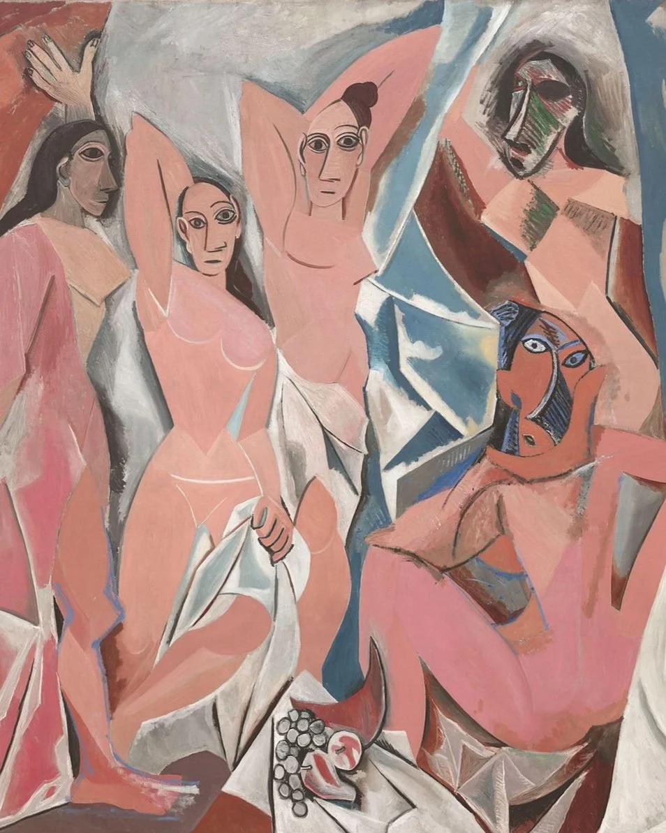
“Les Demoiselles d'Avignon” (1907) (The Young Ladies of Avignon, originally titled The Brothel of Avignon) (detail) by Pablo Picasso is perhaps the most radical painting of the twentieth century
Clearly, there’s no longer a need to prescriptively follow formulaic classical design principles, and it’s up to each and every one of us on an individual level, as well as collectively, to question whether a deliberate abandonment or case-specific disregard of such criteria has a negative or positive impact on the fields of interior design and architecture. As with most things it comes down to personal taste and whether or not one feels a rigorous application of such rules necessary so as to achieve overall harmony and balance in the built environment. “The study of proportion is essential to creating a meaningful foundation. With interior design, I believe that our subconscious plays a crucial but quiet role in determining how and what we feel when we enter a space. Typically, when someone enters a room they find appealing, or appalling, it’s almost always associated with what the interior looks like in terms of furniture, art, objects, paint colour, flooring etc, but rarely with what they feel as they move through the space,” explains New-York based interior designer Casey Kenyon, “I equate the overall feel of an interior to the subconscious reaction one has to what’s happening proportionally in a room. The size, scale, and placement of furniture, art and objects impact the movement and energy in a room. All of the components, no matter how large or small, are in constant conversation with one another, but what that dialogue is, and where it can go is a personal choice. Encouraging some sort of balance between objects and furniture to feel connected is important in any meaningful and lasting conversation.”
Picasso once said that it was important to “Learn the rules like a pro, so you can break them like an artist”, thereby encouraging academic discipline as a path to creative freedom. Whatever one’s approach to design this is an important principle to keep in mind, as the more of an understanding one has in terms of art history and where certain styles, movements and techniques originated, the more it allows one to subvert them in a way that remains intelligent and sophisticated. French decorator Jean-Michel Frank (1895-1941) employed traditional methodologies, but used them in novel ways, for example covering walls in straw marquetry and upholstering furniture in canvas. “I believe that a less severe principle can be found — the mixing of styles,” he wrote in 1935, just three years after he and his business partner, Adolphe Chanaux (1887-1965) had opened a boutique on the rue Faubourg Saint-Honoré, selling everything from cigarette boxes decorated by artist Christian Bérard (1902-1949) to clamshell torchères and plaster lamps, topped with apple-green, lemon-yellow and cherry-red shades. Indeed despite a reputation for severe austerity, having been labelled contemporaneously as the high priest of “rooms no one lived in”, Frank was more than willing to break his own rules (in this case, that lampshades should be simple and unseen), if he felt an interior called for an unexpected dash of whimsy, or, for that matter, an all-encompassing approach that mixed styles, cultures and materials so as to create multi-dimensional surfaces and compositions. “The noble frames that came to us from the past can receive today’s creations,” he explained. “The house that we build now can welcome ancient things of beauty.” Indeed his often playful combination of spare, rectilinear details, inspired by architect Robert Mallet-Stevens (1886-1945), and sumptuous materials such as galuchat, mica, obsidian and vellum helped soften the sometimes forbidding austerity of those interiors pioneered during the first half of the twentieth century. Artistically speaking nothing good can ever come of self-imposed shackles in the form of a rigid design orthodoxy, but one thing is clear; for the industry to move forward and advance there needs to be a far greater focus on the importance of education, and in understanding the whys and wherefores of any given artistic mode or genre.