Paris Mismatch
The Designers Saying Non to Ton Sur Ton
“Elegance is not the prerogative of those who have just escaped from adolescence, but of those who have already taken possession of their future.” — Gabrielle “Coco” Chanel
Paris is often considered the de facto fashion and design capital of the world, with its residents thought of as somehow superior when it comes to their refined aesthetic sensibility. It’s something that, seemingly, still carries a certain cachet, in respect of its ingrained association with innate, rarified good taste. Fashion editor and stylist Carine Roitfeld (b. 1954) recently gave Architectural Digest a tour of her “little garçonnière, as we say in French”, and while sashaying around a monochromatic enfilade of rooms, she was at pains to point out, “I am a Parisian for more than four or five generations, I am what you call today a ‘real Parisian’, if you ask people there is not a lot”. As one might expect, Roitfeld went on to elaborate apropos her approach to decorating, explaining matter of factly, “Nothing is new in my apartment, I don’t like new pieces, I don’t think its chic, I like to have pieces that really tell story behind, that they come with a little soul … it’s a lot of black, I think it makes everything more beautiful, it’s like dress, it’s like a coat, you know”. The light-saturated Belle Époque apartment, Roitfeld shared with her former husband, Christian Restoin, designed by renowned modernist David Chipperfield (b. 1953), contained numerous pieces of custom, contemporary furniture; so one can only assume it was something of comprise vis à vis decorating styles, and that the chrome-plated Barcelona chairs and LC6 dining table were a result of Roitfeld’s vintage bias. As regards the French fashion maven’s current left bank des res, contemporary works by her friend, Paris-based American designer Rick Owens (b. 1962), and tables by sculptor Jean-Guillaume Mathiaut (b. 1975) are, clearly, in terms of inherent chic, an exception to the rule. Taking the idea of “suffering for fashion” one step further and translating it into interiors, Roitfeld proffers, “I love black, so my [bed]room is all black, with some mirrors; the bed, we made it specially, it’s so complicated to undo and redo … that I’m sleeping in a sleeping bag. So I have two, one for winter, one for summer”. The bed in question, presumably inspired by that of industrialist and style icon Gianni Agnelli (1921-2003) in his Via Ventiquattro Maggio apartment in Rome — the brainchild of storied American decorator Ward Bennett (1917-2003) — has a custom-made cover and bolsters in shiny black saddle leather.
As early as the fourteenth century, black, as a hue, has been associated with aspirational living; sumptuary laws prohibited all but the nobility from wearing vibrant fabrics, and as such, black was adopted by the haute bourgeois as a way of expressing style and wealth. Then, following on from sartorially inclined socialite Beau Brummell (1778-1840), who ushered in the “Great Male Renunciation” of the late eighteenth and early nineteenth century, black was adopted as the uniform of choice by Romantics such as Byron (1788-1824), Shelley (1792-1822) and Keats (1795-1821), who regarded it favourably for its melancholic aura of despair. “Black is poetic,” proclaims Belgian fashion designer Ann Demeulemeester (b. 1959). “How do you imagine a poet? In a bright yellow jacket? Probably not.” For the fairer sex, however, the wearing of black was largely confined to mourning, or, scandalously worn by “women of loose morals”, as depicted in Édouard Manet’s (1832-1883) A Bar at the Folies-Bergère (1882) and John Singer Sargent’s portrait of Madame X (1883-84). The latter, a simple composition of a porcelain-skinned woman with patrician features, depicts ex-patriate American socialite, Virginie Amélie Avegno Gautreau (1859-1915), wife of fabulously wealthy French banker and shipping magnate Pierre Gautreau. Wearing the crescent-shaped tiara of Diana the Huntress, Sargent portrays her as a creature of predatory sensuality, whose plunging black gown is her costume de chasse. Following the painting’s controversial reception at the Paris Salon of 1884 — that sacrosanct institution of bourgeois French culture — the ensuing scandal was such, that Sargent, unable to find work, was forced to up sticks and leave the French capital for pastures less prudish. According to an article in the Chicago Tribune, Gautreau’s mother, in an abject fit of despair and dejection, burst into Sargent’s studio, lamenting, “All Paris is making fun of my daughter ... She is ruined. My people will be forced to defend themselves. She’ll die of chagrin.” Yet, it wasn’t the painting’s perceived lewdness that so offended the haute bohème, the artwork was something much worse — it was considered tacky. Evoking the immorality and excesses of fin de siècle Paris, originally, Sargent had painted one of his sitter’s bejewelled dress straps dangling provocatively from her shoulder; Gautreau had a reputation as an adulteress, and as such, it was seen as an allusion to her alleged promiscuity and loose sexual morals. Of course, other models had, contemporaneously, been painted showing far more flesh, and in all likelihood, it seems, for whatever reason, polite society was simply ready to turn on her; a prime example of the old adage, “build ‘em up to knock ‘em down.”

The living room of the Templeton Crocker penthouse, designed by Jean-Michel Frank (c. 1930), with walls and ceiling clad in parchment, a piano hidden behind a low folding screen, and a quartz block lamp
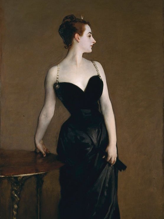
John Singer Sargent’s (1856–1925) portrait of “Madame X” (Madame Pierre Gautreau) caused an outright scandal when it was shown at the Paris Salon of 1884
The pivotal moment for black as we know it, came in 1926 when minimally minded couturier Gabrielle “Coco” Chanel (1883-1971) first debuted her “little black dress” — a snappy, long-sleeved, drop-waisted shift — which, capturing the zeitgeist, American Vogue dubbed “The Chanel ‘Ford’ — the frock that all the world will wear”, in reference to the then wildly popular Model T motor car. In other words, it was a garment so simple it could be accessible to any shopper, or, “a sort of uniform for all women of taste”, as the magazine so presciently put it. Above all else, Chanel championed simplicity over superfluity, a mantra reflected in her colour palette. “I imposed black; it’s still going strong today, for black wipes out everything else around,” she would later declare in her typically imperious manner. It might not seem all that ground-breaking today, but in terms of fashion, it was radical, in that Chanel helped liberate black from its ties with death, turning a simple slip into a sartorial standby. Self-proclaimed “King of Fashion”, Paul Poiret (1879-1944), the couturier credited with emancipating women from the “corseted silhouette”, was, up until the early twentieth century, considered the peak of chic, that was, until Chanel knocked him from his proverbial throne; upon a chance encounter on the streets of Paris, Poiret, noting Chanel’s all-black ensemble scoffed, “Madame, for whom do you mourn?” Regarding him icily, she replied simply: “For you, monsieur.” Touché! Of course, as regards its egalitarian credentials, Coco’s “LBD” was far less progressive than mythology might suggest. According to Shelley Puhak, writing in The Atlantic, the couturier’s innovation was an appropriation of servant’s uniforms, part of the trend for “la pauvreté de luxe”, or luxurious poverty, “reserved exclusively for those who could ‘afford’ to look poor by pretending that they simply couldn’t be bothered with fashion. But on closer inspection, there would be some small detail in her seemingly anonymous garment — a certain cut or fabric or label — that acted as a secret handshake for those in the know.”
Fashion is, of course, nothing if not cyclical, and in recent years, after decades of vulgar excess, there’s been an increased focus on the idea of “Quiet Luxury”, a style evinced by the morally bankrupt Roy family in HBO headline show Succession, which, since its 2018 debut, has become a source of widespread sartorial fascination. Eschewing logos or flashy brand names, it’s an aesthetic characterised by sober tailoring, neutrals and the more subtle social signifiers of vicuña and Himalayan cashmere; despite flying in the face of the widespread trend for “logo-mania”, each and every detail conveys membership of an exclusive, international club of high net-worth demiurges, who are, by and large, proponents of this particular brand of monied restraint. Plus ça change. In terms of French interiors, the inherent penchant for ton sur ton can be attributed to maître of Minimalism Jean-Michel Frank (1895-1941), the ascetically inclined French decorator whose spartan, parchment-clad interiors were once the acme of pared-back Parisian glamour. Like Chanel’s crepe-de-chine little black dress, Frank is credited with introducing Parisians to luxe pauvre, a philosophy of “impoverished luxury”, whereby interiors were stripped down to their bare essentials, finding beauty in perfectly executed proportions and rarified materials, including shagreen, vellum and mica. Frank’s own Cistercian-austere apartment, in an eighteenth-century building in Saint-Germain-de-Prés, was a calling card for his “renunciation aesthetic” of extreme refinement. Choosing what was, at the time, a somewhat unusual palette of materials, its interiors were an elegant, understated amalgam of wood, marble, straw, parchment and Hermès-leather. An exercise in studied emptiness, there was nothing that wasn’t entirely necessary, with no pictures, paintings or superfluous ornamentation other than the occasional, meticulously selected item; for example, a Chinese statuette on the dining room mantelpiece and a wire sculpture on the bedroom wall. The overall impression was one of elegant, understated luxury — an antidote to the florid eighteenth-century pastiche favoured by the majority of the haute bourgeois and a welcome respite from the chaos of interwar Europe.
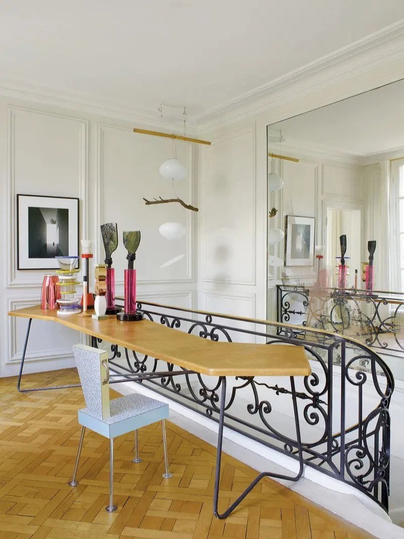
The home of French architect Charles Zana, Paris, demonstrative of the sort of elegant, refined style the city has become known for, image c/o Charles Zana
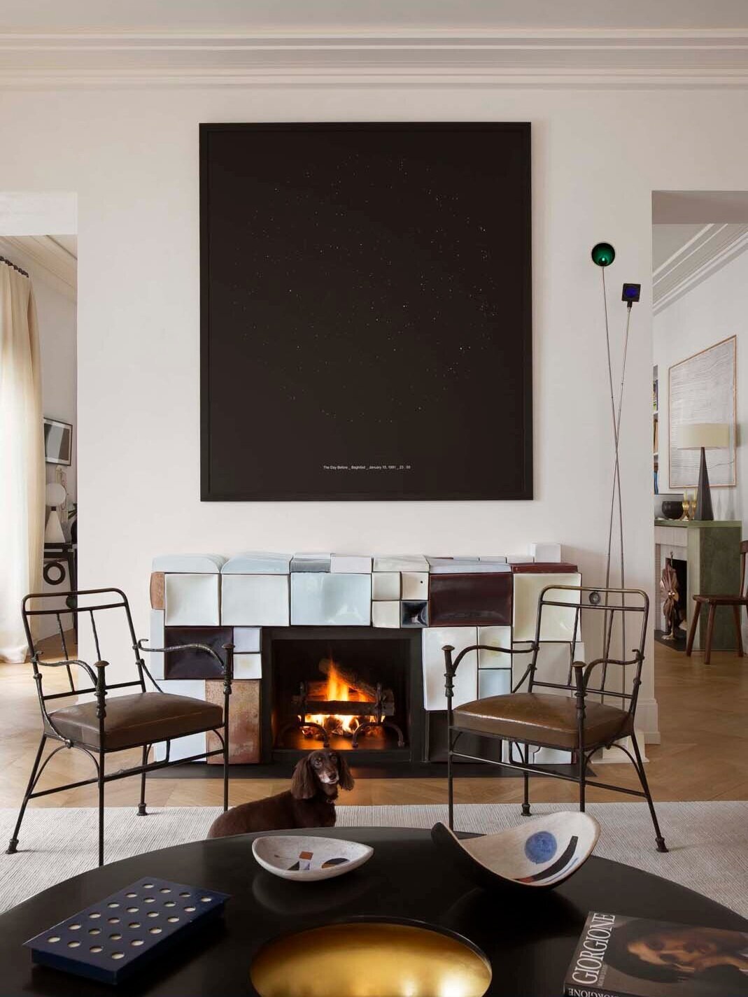
The former home of interior decorator Caroline Sarkozy and gallerist Jacques Lacoste, Paris, in the sitting room a ceramic fireplace by French artist Emmanuel Boos and a pair of Giacometti armchairs
Yet, despite Frank’s sumptuously understated aesthetic, arguably, being the progenitor for contemporary French design, for some of his clients, at least, the monastic severity of his interiors proved a step too far. The novelist François Mauriac (1885-1970) was told, his son recalled, that the ensemblier was “willing to decorate our new apartment so long as we agree to get rid of most of our furniture”. Mauriac reluctantly agreed, and yet, of the finished result he lamented its Spartan, minimally furnished appearance, complaining that he could no longer find his bearings, that “it is cold” and “sad,” “in the taste of the abbey cell of a monk,” grumbling long after completion that, “this century will be known for inventing ruinous poverty”. Since the first generation of Art Deco collectors (such as Félix Marcilhac (1941-2020), Andy Warhol (1928-1987) and Sandra Brant (b. 1955)) first rediscovered his work in the 1970s, “Le phénomène Frank” has only continued to gain momentum. Now every self-respecting collector of blue-chip twentieth-century design owns at least one or two pieces, with the elegant oak and parcel-gilt croisillon coffret he designed in 1937 for Guerlain’s Coque d’Or perfume, being the entry-level drug of choice. As Carina Villinger, head of twentieth-century design at Sotheby’s, New York, succinctly explains, “The refined, subdued sensibility, the absolutely magnificent craftsmanship — it’s just the taste that people with a lot of money are looking for.” For much of the twentieth century, Paris was at the epicentre of the European avant-garde, from the rise of Art Deco, through to the modernism of Le Corbusier (1887-1965), Jean Prouvé (1901-1984), René Herbst (1891-1982) and Charlotte Perriand (1903-1999) et al. From Chanel to Schiaparelli and Saint Laurent, fashion and design became inextricably intertwined, and with it came what Le Figaro refers to as “the elitist Parisian spirit” — a certain attitude and aesthetic, that might best be described as studied nonchalance; whereby an enormous amount of time and effort goes into achieving an appearance of casual, understated elegance. Jean-Michel Frank, as art historian Pierre-Emmanuel Martin-Vivier writes, “played with the codes of design and reduced styles to shadows, essences.” Today, one need only look at contemporary French interiors to see how this history of savoir-faire, these “essences”, continue to impact design, with bouclé, straw marquetry, plaster and limed oak seen frequently in the work of contemporary designers, amongst others, Jacques Grange (b. 1944), Charles Zana, Joseph Dirand (b. 1974) and Pierre Yovanovitch (b. 1965). Yet, despite the city’s buttoned-up, classical inclinations, there are an increasing number of up-and-coming designers, looking to follow in the footsteps of Yves Klein (1928-1962), by injecting a dose of colour into the city’s uniform, tree-lined boulevards. As such, we spoke to Uchronia’s Julien Sebban, and artists Nara Lee and David Luraschi, who recently made their first foray into the design world, with a collection of flexible foam furnishings.

The “Peanut 1” coffee table by Uchronia, created in collaboration with David Roma, with its eye-catching lacquer top, image c/o Uchronia

Uchronia’s “Peanut” dining table, made in collaboration with Fabienne L’Hostis, a ceramic artist and Raku specialist, image c/o Uchronia
TLL: The French have a reputation for pared-back, ton sur ton style, in terms of fashion and interiors. You clearly don’t prescribe to such a stereotype, but what is it that led you to work with such an outré colour palette?
Uchronia: When I came back to Paris after studying and living in London for seven years, I realised that the work I was doing, what I was interested in, was not what was happening here. Everything was cream bouclé, white walls, walnut; very chic, but not very fun. We want to create spaces that illicit joy in the people using them and to do that, we often use colour. Different colours have specific physiological effects, subtly altering our mood, giving energy or calming us. Stepping out of the grey and into a space lacquered orange, suddenly you glow, you’re in a new saturated reality, even if it’s only briefly, you’re someone different!
Nara: We grew up in environments where we were free to do whatever we liked, and I think that helped us in our work. Also, up until now, we’ve been working in fashion; this was our first step into the world of design — so we were less sensitive to French style and interior trends. But I think, in fact, it focused us on building what we wanted to create, not worrying what people would think or say — as we’re kind of from nowhere. Colour has always been an important element to me in my work; I’m drawn to it in everything I do. For FAMILY we tried various combinations and thought they were, almost, finalised, when our art director, Clementine Berry, suggested we use red; which has since become part of our brand identity.
TLL: Paris is a beautiful city, but, in terms of art and design, often set in its ways, with a somewhat uniform aesthetic. Do you ever find such an attitude stifling in terms of creativity?
Uchronia: Paris is an incredible city, very aware of itself, constructed in a rigid order, centred on large squares and avenues, with so many striking, orchestrated views, all the buildings of the same height, carved from the same stone, it’s wonderfully photographic; and just like the tourists who love posing, the city loves posing too! This same attitude is reflected in the vibe of contemporary interiors — uniform, muted, polite, respectful, chic, but boring; we don’t look to them for inspiration. What interests us, instead, is craftsmanship, which is right on our doorstep!
Nara: That’s right. I think Paris has a deep artistic history — it’s one of the best cities in the world for design and I really admire the classic, elegant good taste. The French, however, are less fond of anything new or different and there are fewer quirky, funky, artists and designers compared to London and New York. This is our first time showing work to the public in France, so it’s too early to answer the question; but I feel like we have to continue doing what we find interesting and exciting — maintaining the strong, original identity we’ve created for ourselves, rather than focusing on the wants of French consumers.
People often talk of French savoir-faire, in terms of craftsmanship and quality, which, apropos “high design”, historically speaking, is often associated with names such as Georges Jacob, Jacques-Émile Ruhlmann and Paul Dupré-Lafon. Do you think your work is in any way a continuation of the art historical canon, or do you consider it a complete break from tradition?
Uchronia: One of the best things about working in France is access to the most incredible artisans and ateliers with centuries-old savoir-faire. Working with such craftsmen enables us to realise our existing ideas, and, often more interesting, to develop new pieces based on the skills we encounter. Working with scagliola, raku or passementerie, we start to explore what each of these materials or techniques could become. We’ve never really considered our work as part of the canon, but at the same time, we’re not fighting against it. There’s a great tradition in France of supporting craft through the production of high-quality pieces by the greats of design and decorating. We can only hope to follow in their footsteps and similarly support craftsmen today. If we can produce interesting furniture and interiors that speak of our time, but also reference the past, whilst utilising, preserving and challenging the skills that we presently have, we’ll be happy!
David: Continuation or not, if you attempt originality you’re a witness of your époque, like a stamp. You can’t escape the vernacular and history. What’s interesting is authorship within this context. I often refer to film history because that’s what I’m most familiar with. Nara and I are not trained industrial designers or architects. Nara studied fashion design and I studied filmmaking. As such, we’re uneducated in the world of design; which I think can be seen as an advantage, especially in this era of information. People can be overeducated and this knowledge could sabotage some kind of flux and expression that needs to remain naive. In our post-discipline, post remix époque, what’s interesting is what fresh ideas you can bring to this savoir-faire. Today the lines between high and low culture, art and advertising are more blurred. Design is also witnessing a democratisation like fashion has before. It’s more accessible which allows more people to come forth and propose new perspectives or shifts. Nara and I share a love for naive intuitive storytelling that can be sophisticated without trying to seduce. That was a big thing for us. We’re very proud of how it’s a simple project, simple items that everyone can interact with — even those who’ve never heard of Jacques-Émile Ruhlmann!
Jean Royère started working post-war, and such, a key tenet of his philosophy, was to introduce a splash of whimsy into a world weary of conflict. Given the fractured geo-political environment, do you think your bright, colourful furniture comes as a welcome respite from a sometimes stiflingly oppressive world in which we’re living?
Uchronia: The world of Royère is one I’ve become well acquainted with. My husband, Jonathan, is the Creative Director at Maison Royere, and we’re both great fans of his work. Funnily, this point is something we often discuss. Royere’s work was joyful, soft, voluptuous and optimistic; it can be compared to Christian Dior’s “New Look” — abundant, liberated and generous. Right now, everything feels dark. The future is a scary proposition, filled with doubt, the immediate threat of war and the not-so-distant threat of global warming; or global catastrophe, as it’s recently been re-branded. The only way we know how to help make any difference is to try to make our own little world more pleasant, in our own way. If we bring some joy or a sense of playfulness to the spaces we design, the people using them can, in turn, hopefully, pass their joy onto others, and if it spreads, and more people catch the feeling and pass it on, well hopefully things will just be more pleasant. It might sound simplistic, but if we all practised this, imagine how much better the world would be.
Nara: Yes, I completely agree. In life, we can’t avoid frustrating and difficult moments. I think that an attitude of not losing humour, even in such difficult situations, is a great wisdom to have in life. No matter how difficult a situation is, if you laugh a little, you feel that the heaviness of the situation gets diluted and the problem feels lighter. This is the attitude I want to have the most in my life. And I really like the way our work looks humorous and bright rather than elegant or serious.
David: Absolutely to come back to the genesis of this project, and even our friendship — we had an instant crush on each other because we share the same vision of the world — our mission is to bring playfulness and colour to this existential realm that can be kinda dark sometimes. So absolutely, if we can provide a break, for anyone, that’s a great accomplishment. When we presented our work at Lafayette Anticipations people took off their shoes to touch the objects, some even took naps beside them.
The name, Uchronia, draws from a neologism coined by French philosopher Charles de Renouvier, whose two leading ideas are a dislike of the “unknowable” in all its forms, and a reliance on the validity of personal experience; but do his theories bear any relation to your own personal design ideology?
Uchronia: What resonated with me about Renouvier’s “uchronie” was the notion of re-writing the past, or rather creating a new narrative to a story where we think we know the ending. This utopian ideal sits in a space without time, a concept we have and will continue to explore. To create something novel from the old or hackneyed. Something that doesn’t feel like a strange distant future … [continued]
… but rather something new with the comfort and familiarity of a past experience. We always want our projects to be grounded in their location, supported by their construction, whilst encouraging the user to see or feel in a fresh way.
Nara, your work has been described as screaming “come play!”, but is that an accurate reflection of what you set out to achieve?
David: We called our first campaign “Time to play!”, and, of course, Nara and I, and our art director, Clementine, had the post-pandemic in mind. It’s not the only thing we set out to do but it’s a simple concept that everyone can understand; right now we can’t tell you exactly what we hope to achieve, but we want to develop this intuitive playfulness, something that has great functionality, that can make mundane activities — whether at home or in public — more engaging and accessible to the biggest possible audience.
Uchronia, you employ a panoply of skilled artisans in the production of your pieces, including specialists in paint techniques, wood marquetry and, perhaps somewhat more unusually, a Raku master; would you say, on that basis, despite its contemporary, even pop art leanings, your collection, in essence, follows on in the tradition of craftsmanship that set French decorative arts apart since the eighteenth-century?
We wouldn’t be able to do what we do without the incredibly skilled craftsmen that we collaborate with. Although our designs might be bright and graphic, they’re rooted in tradition. From this base, we’re able to push the techniques to their limits, for example, our Peanut and Cookie tables — with their orange to purple degradé Raku ceramic tops — which have been a real challenge to execute. We recently created a collection of fabrics with Manufacture Prelle, the last remaining silk house in Lyon — the historical epicentre of the industry. The experience was incredible, going through their archives, trying to understand what was created and how, and then seeing how we could develop something fresh from a classical motif.
It really is an honour to work with them, especially since most of their designs date from the seventeenth and eighteenth centuries — with the exception of their most recent collaborator, Ruhlmann, which was still almost a hundred years ago! We love waves and graphic patterns, and noticed how the backgrounds to many of their jacquards have large waves running through, from which floral designs emerge. Although our styles are seemingly incompatible, there are in fact so many similarities and inspirations. We took the wave or “rivière” as our starting point; creating a new take, retaining their exact wave, with its lace edge — but rather than the traditional figurative florals, we used our own graphic, slightly childish, six-petal flower, which in the past we’ve used as the shape for tabletops and cushions. It sets an example to other heritage houses to trust the young generation. It’s a true collaboration and it’s only the beginning!
Nara, fashion and interiors have always been inextricably intertwined, but having started off working in the former, do you think your attitude to design is perhaps more editorial than someone with a pure design background?
Nara: Yes. Even though we didn’t major in product design, I think it can be to our advantage. When I design, I sketch anything that comes to mind, letting my imagination run wild — not thinking about realistic and practical considerations. So sometimes, when I look at my sketchbook, I think: “How can I make this?” On the other hand, product designers tend to think too much about reality from the outset. I need to learn more about that, but this process of sketching, without focusing too much on practicalities, helps me to imagine a wide range of different things and to come up with more creative and original ideas.
David: Working in fashion has trained us to collaborate as a group and produce in a quick turnaround. We launched this project a year after creating our studio and it took less than six months to develop the collection.
Uchronia, after spending time in time in Sydney, Johannesburg, New York and Buenos Aires, you settled in Paris, where, in effect, you formed a collective, asking likeminded designers, artists and craftsmen to join you in your quest for a “post-architectural” world; what exactly do you mean by this, and how does it impact your approach to design?
Good question [laughs]. The notion of “post-architectural” is reliant on the need to look past our preconceived view, seeing the architect, not as the master, but as a facilitator. We are there not to dictate but to work with our extended teams to try and create something new, something fun and exciting for all of us. Since founding Uchronia in my final year at university, besides a few internships, I didn’t have any real experience of how an architectural practice worked. This naivety allowed me to create a way of working that came about quite organically. Arriving in Paris and working on a design for the restaurant at the Musee d’art Moderne was a giant step and a huge responsibility. I learned some hard lessons, and not least, who you can trust!
When one thinks of an architect, it’s a man standing behind a drafting table, creating plans. Yet in reality, those ideas might be good, but they have to be executed — and to be done well, you need great makers. The master, Carlo Scarpa, is known for the close relationship he fostered with his builders, working through problems on site, face to face, rather than behind a screen, detached from the realities of making. As such, he was able to push his designs to the absolute limit, beyond what he could ever even have imagined. This model is, essentially, a continuation of the guild systems, where different craftsmen would assemble on site and create a building together; the architect was not there to dictate, but rather facilitate the various métiers in their collaboration, working towards a common goal.
Nara, you’ve described the collection as “modular in many different ways”, with “limitless” compositions, and “a reflection of the user’s imagination”. Who do you see as your client, and do you think, in reality, they’re likely to use these “life-size building blocks” in anything other than conventional arrangements?
Nara: When we exhibited our works for ten days at Lafayette Anticipation, we were able to observe how people reacted. It was interesting to see how everyone enjoyed our work in their individual ways, with different purposes; a father built a slide for his children and couples flipped the sofa over and lay down together to relax. There were more people making creative arrangements than using furniture in a conventional way. We’d created an environment in which they felt free to be creative. In that respect, the fact that unconventional and innovative arrangements are possible, unlike other furniture, is a great advantage of our work.
Uchronia, Your “Peanut” dining table features an hourglass-shaped top, which was designed as such, you say, so as to allow guests to see and interact with all those seated. How is its design beneficial to stimulating conversation over traditional configurations, such as say a circle, oval or rectangle, when presumably, certain guests will be angled away from one another, effectively, separated into two separate zones?
We like to create furniture that can be used in surprising ways, so when approaching a new piece, rather than focusing on aesthetics — in terms of colour or material — we start by thinking about function. When using cutlery by Arne Jacobsen, for example, as we do daily, the narrow design prevents you from just stabbing your fork into the food and throwing it back, you need to take considered bites, shaking us from our automated movements and making us take time to think and be conscious. Not immediately knowing how to use a piece lends an element of surprise — as if experiencing an action for the first time.
When we created the Peanut dining table, we thought about the limitations of traditional configurations. Rectangular tables feel problematic in that there’s a hierarchy, with two people at the head, separated from the rest and on view; it allows for conversation across the table, but forces you to turn to your neighbour. The shape is also difficult to move around, losing fluidity in a room. Round tables are meant to be more equitable, and allow you to see everyone, but it’s hard to talk, as you’re so far away. The Peanut on the other hand is not about hierarchy, or even equality, it’s about creating new experiences. Everyone has a different experience based on where they sit. In the middle, you can turn and tune into either side.

Nara’s “Family” collection of colourful foam furniture, pictured, the footrest, side table and coffee table, image c/o Nara
Nara, since Wendell Castle and Marc Newson et al, the divide between painting and “design as art” has become increasingly blurred, and more frequently museums are displaying furniture alongside painting and sculpture. You’ve referred to your work as “art furniture”, but why is it important for you to make that distinction?
Nara: The purpose of furniture is that it has a clear function — such as a chair for sitting, a table for working or eating etc — but art doesn’t have a function. In terms of that, FAMILY is closer to art in that it stimulates people’s imagination and inspires them; they can use it without any purpose, in unconventional ways, making different sculptures, or with a purpose, as furniture. In that respect, FAMILY is somewhere between furniture and art, as it’s functional, but also, inspires people, like art. So, rather than calling it just “furniture”, we wanted to call it “art furniture”.
David: Ah interesting you suggest a blurred line as well. Perhaps we characterized the FAMILY as art furniture because we like the idea of encouraging our audience with its modularity and the fact that they can interact with its sculptural aspect and not just its function. It’s alive!
Nara, each piece in the collection is made from foam pieces, employing industrial production methods, so as to achieve the precise forms you developed using 3D software. As such, you’ve detailed the process customers should follow in disposing of your furniture safely once it’s “worn down”, so as to minimise the environmental impact of using such synthetic materials. More traditional upholstery, even that of Royère, which utilises a wooden substructure and feather-filled cushions can be repaired and reupholstered. As such, do you consider your furniture is built to last, and have you considered employing natural materials with a lower carbon footprint?
Nara: From the beginning, we wanted to use eco-friendly materials, so we researched recycled polyester. Among them, we found an Italian company called ReMat, which makes recycled polyester foam, but we realized that it wasn’t suitable because it was difficult for people to carry due to its weight, which is a disadvantage; and lightness was one of the most important considerations, so we had to choose lighter foams.
David: We love the idea of more environmentally friendly solutions and will always favour them if they align with our designs. Weight was essential here because of the modular and interactive aspect. But we are very excited to evolve and continue to celebrate FAMILY with new materials and move as close as we can to the lowest carbon footprint. The foam we employ now is incredibly durable and can be reupholstered — we put it to the test in a museum for two weeks and it was met with a lot of enthusiasm!
Working in the worlds of art and design, I frequently meet some truly fascinating people; without, necessarily, naming names, what’s the most memorable thing you’ve heard said at a party?
Uchronia: I don’t really go to art parties … maybe I should! One thing I loved at Design Miami this year — a few stands had the Ours Polaire sofa by Jean Royère, selling for $1.3 million. Talking to the gallerists, their answer was: we had to have it, that’s what sells. To me this is crazy, owning a $1.3 million sofa! I would be scared to touch it — yet at the exhibition I sat on it! [laughs]
Nara: After launching NARA, many friends congratulated us. One of them, the art director, Christopher Renard said to me: “Most people have really cool ideas, but not many people actually realise these ideas. The reason why this project is great is that you had a good idea and you have actually realised it!”
In an ever-changing world, what are the biggest problems facing today’s designers, and indeed for that matter, the industry at large?
Nara: I think that if you create work with the expectation of receiving a reward, you will escape from your own world and you will be obsessed with the outcome. I believe that creating your own work without being swayed by reward or reputation is the most important quality to have as a designer — and it’s something that should not be threatened!
David: Guts! And themselves. Without going into the material or academic aspects — I love looking at this whole thing as a human experience and would love us all to perpetually allow ourselves to transform and dare because there is nothing more thrilling than self-discovery and surprise.
An object you would never part with?
Uchronia: I have an obsession with lamps! I collect them and love them. A good lamp in a shitty space will change everything — it’s the best tool to create a vibe. I live surrounded by objects, yet there’s one I don’t ever want to part with and will keep forever; my Tahiti lamp by Ettore Sottsass. It was a gift from friends for my twenty-third birthday; none of them understood what it was or why I wanted it. Now they see the world I live in and love it. It was my first real piece of design, and even though it’s a reproduction it takes a big space in my heart.
David: A belt? To hold up my pants? A camera to record time? I often need to make order — to make myself believe I control something. Photography has many times given me this illusion.
What was the last thing you bought and loved? Why, and what is it that drew you to this particular item?
Uchronia: I finally got a Triple Play stool by Gaetano Pesce — a piece I’ve wanted for a very long time. Pesce is a master designer, bringing narrative, depth, and innovation to his work — a true inspiration! We already had a couple of pieces, but the stool is so concise; the technique and construction so simple, entirely reliant on the materials used. Architecture as an object! It sits very happily alongside all the other little stools we have, such as my own Bisou stool and a milking stool by Robert “Mouseman” Thompson. We really love stools, they sit like a constellation in our salon, easy to move, sidling up to the sofa, a perfect perch for tea!
David: A cookbook by my friends Olga Prader and Apartamento. Prader’s illustrations are full of fantasy and humour — and a cookbook can be super useful!
What would you like to own that you currently don’t possess?
Uchronia: A few years ago, an incredible desk by Guy de Rougemont came up at auction, which we sadly missed out on. It was so special. Its decoration in marquetry and lacquered wood — an ingenious optical trick, creating light and shadow — was mind-blowing. It was impossible to date, it looked at once Egyptian and Art Deco with some op-art thrown in for good measure — but it was made in the 1980s. The one that got away!
Nara: Pierre Sala’s Clairefontaine desk — David has one and I find it so cute and fun; I’d like to put it in our office, so we have one each to work from!
David: I would love to have a fireplace. The joys of a fire are unequaled like looking at the sea! Very therapeutic.
What’s the best gift you’ve been given? Who gave it to you, and why did it mean so much?
Nara: Last winter, my parents came to visit Paris for the first time. When they arrived at my house, my mum took a pair of tacky, fuchsia-coloured gloves from her jacket — I have no idea where she got them from! I felt touched to think she’d put them there so as not to forget them. I probably won’t wear them as they’re too old-fashioned, but I think about her every time I see them!
David: For my birthday my girlfriend gave me a pack of customised Scopa cards. They’re fantastic! Scopa is an Italian card game I’ve always played with my family. My girlfriend worked with an illustrator to design an entire deck; each card showing me comical situations, like riding a frog — my favourite creature — holding thunder or picking figs. Pure genius!

Nara’s “Family” collection, pictured, the armchair and footrest, designed to encourage interaction, image c/o Nara
What’s your biggest extravagance?
Uchronia: By far, my wedding necklace. My husband designed a kaleidoscope shaped like a spiralled shell, dotted with stones that are meant to be beneficial for my constitution and astral theme — some taken from his mom’s old jewellery. Even its size is crazy; it could be ostentatious if it wasn’t so fun!
Nara: Mario Botta’s Shogun floor lamp. After looking for several months, I finally found one in perfect condition from a great vintage dealer, Alessandro Carraro, in Milan. It’s the perfect design and style. I’ll keep it for the rest of my life.
David: To believe in myself!
What’s your biggest regret?
Nara: That in my late twenties, I didn’t see much of my family in South Korea. I was busy with work, travelling and my own personal life. My main concern was myself and I didn’t pay much attention to them. I’ve now realised the importance of family, so I go back and see them as often as I can. Before, it was out of obligation, but now I truly cherish and enjoy the time I spend with them.
David: To spend any seconds on the idea of regrets!
Where’s the most unforgettable place you’ve travelled?
Nara: Last summer I went to Hanoi in Vietnam. It was my first time travelling alone in a new country where I didn’t know anyone. It gave me the confidence and courage I could do and enjoy anything by myself. I went to a lot of local restaurants where you sit on very low plastic chairs and tables; one of them, Bánh Cuốn Bà Xuân, served a traditional Vietnamese dish — a soft rice role, filled with ground pork and mushrooms; I found it so relaxing watching them make rice sheets outside the restaurant each morning!
David: I loved camping in Oman; there are wonderful Wadis and Jebel Shams. We played on beaches with bioluminescent plankton, went to a goat market, met local camels and saw the turtle life cycle.
Tell us about a recent “find”.
Uchronia: We recently bought a daybed by Charles Jencks, specifically designed for his home, the Cosmic House, in London. The space is one of my favourites, a completely insane, imaginative, poetic, playful, colourful, rich and innovative mess of references, collaborations and materials. The outside is painted white and the interior black — like a Bridget Riley painting — upholstered in zebra print. The cushions are all different sizes, but the fun comes with the head, leg and tail-shaped cushions, which, when consciously arranged, create an abstracted version of the animal itself — which is evocative of Op artist Victor Vasarely’s black and white zebra works; it also reminds me of Nicola L’s sofas with cushions shaped like human body parts. Funnily, it’s the only white piece of furniture in our apartment, and so it sticks out like a sore thumb.
If you didn’t live in Paris, where would you live?
Uchronia: I’ve always said I’ll move back to Buenos Aires at some point — a place that feels so special to me — it’s just the economy there is bad!
I’d probably go back to London, as I miss the energy — all around Dalston is my vibe, where I used to live and hang out — everything there is just such a gem and inspiration; and with The Picklery and Primeur around the corner, you never have to leave!
If you had to limit your shopping to one neighbourhood, in one city, which would you choose?
Uchronia: Saint-Germain-des-Prés in Paris. It has the best mix of shops and galleries; like Marcilhac and Jacques Lacoste — which I get dragged to by my husband to see all the Royère! I love Galerie Kugel, for the wonderful selection of museum-quality antiques in a transportive space. Then there’s Dries van Noten, not only for the clothes — which are a favourite — but also the beautiful store, which I would happily live in; it’s telling it’s on Quai Malaquais, rather than Avenue Montaigne or Saint Honore, like all the other luxury stores. Then there’s Officine Buly, around the corner — great products in beautiful packaging, that you can have monogrammed or labelled in calligraphy. And obviously, Café Nuances, which we designed!
Nara: Seoul, South Korea. In fact, I didn’t realise it was such a cool place to visit until I lived there. I especially like an area called Euljiro; once the centre of Seoul, it was in decline, until about eight years ago, when retro became popular and younger people started gathering there. Since then, it’s become an interesting area — referred to as Hip-jiro — where traditional and hipster coexist. There are some really great cafes and restaurants hidden away in old industrial areas — next to cheap beer bars where office workers go to drink at the end of the day. It’s interesting seeing different generations do their own thing in the same place. When I’m there at night, it reminds me of a scene from Blade Runner!
What’s the best book you’ve read in the past year?
Nara: It’s hard to choose only one book, but The Beauty of Dusk (2022) by Frank Bruni made me cry while reading it. Bruni had a successful career working as a columnist for the New York Times when he suffered a stroke and lost his vision in one eye. Since then, he’s continued to experience various losses and traumas. Writing about his thoughts and feelings, he says life is about adapting to loss and how to live with it. Ultimately, what he is trying to say, is that whilst you can’t avoid, or control loss — it’s something you can grow from, in terms of it making you a better person, and giving you a wider perspective. I was impressed with his point of view and it helped me to think about life in a new light.
David: Même le bruit de la nuit a changé, by my friend Violette d’Urso — about her quest to learn more about her father, whom she lost at a young age. It’s an inspiring mix of investigation and fantasy, and also a celebration of Italy and its culture, which I love.
What would you do if you didn’t work in design?
Nara: I think I could have been a chef. Since I was a child, I bought ingredients and made special dishes for my family; I saw cooking as creating something from nothing, which attracted me a lot.
David: I recently came to the conclusion that I would have loved to be a professional athlete. Sports just do it for me; it allows me to release a lot and it’s profoundly human.
What’s the greatest challenge of our time?
Uchronia: Climate change.
Nara: I feel like it’s getting more and more difficult to be in a situation where you can be in total solitude, without interruptions, such as phone calls, messages, notifications, music etc — it makes it harder to concentrate, and as such, we miss out on opportunities to create.
David: Same as it ever was? To be human? To make sense of any of this?
What’s next?
Uchronia: So many collaborations with amazing French houses such as Prelle and Maison Charles; we’ll also see our furniture in some historical Parisian stores very soon. Aside from furniture, we’re working on some exciting new interiors projects, and we’ve also just finished our own home — tucked away in a little courtyard in Montmartre — which I’m looking forward to sharing soon!
Nara: We’re developing some new objects that we’re excited about, so stay tuned!